Case Study
Every Project Starts Somewhere
Book covers are important. Despite what people may say, a book is often judged, and sold by the cover it presents itself with. Here, I needed to design a series of book covers for already well known works, and within my cover I needed to truly capture the audience. These covers needed to bring out the essence of the stories that had been written inside them. So firstly I had to start at the source material and figure out what exactly each story was known for, and what was important about each one.

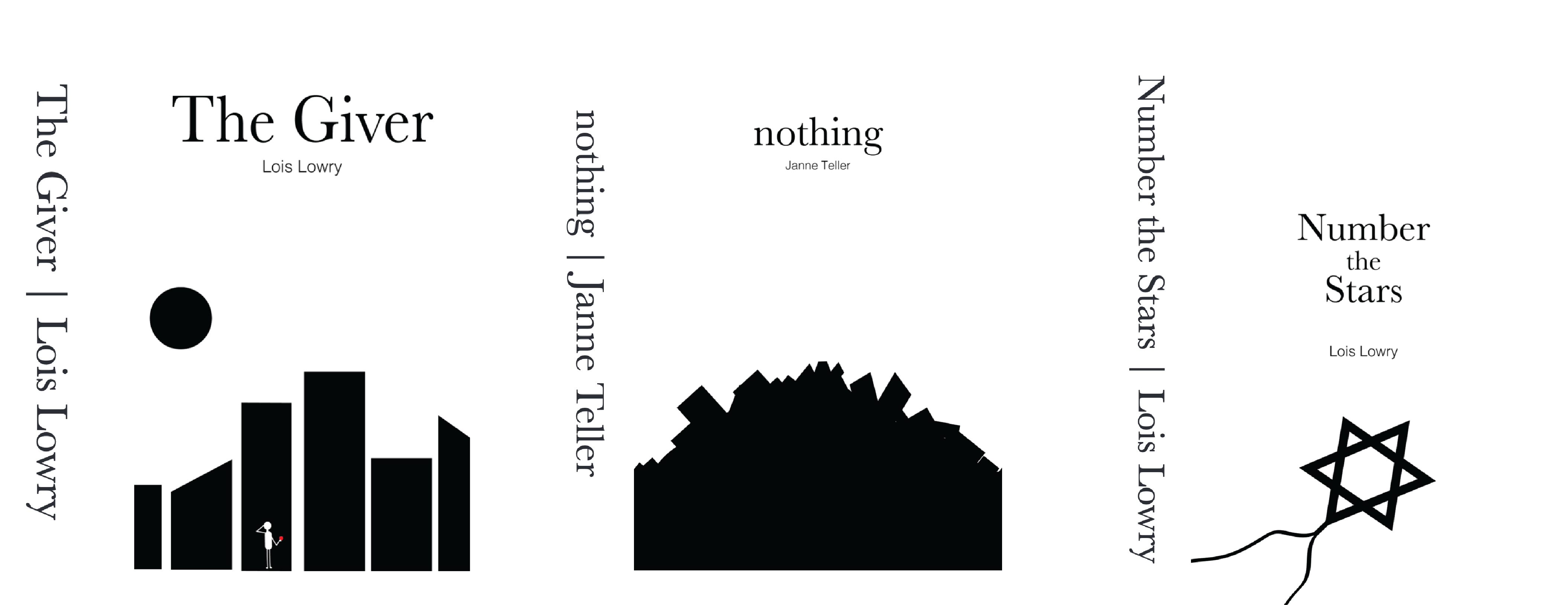
The Giver
The Giver is a story near and dear to my heart. A story about a boy who despite everyone else in the black and white world, can see color. I started drafting concepts with this in mind, trying to create something that displayed this unique protagonist. But I wanted to present it in a minimal sense, I know a lot of covers do a bit too much, I wanted something that contrasted that.
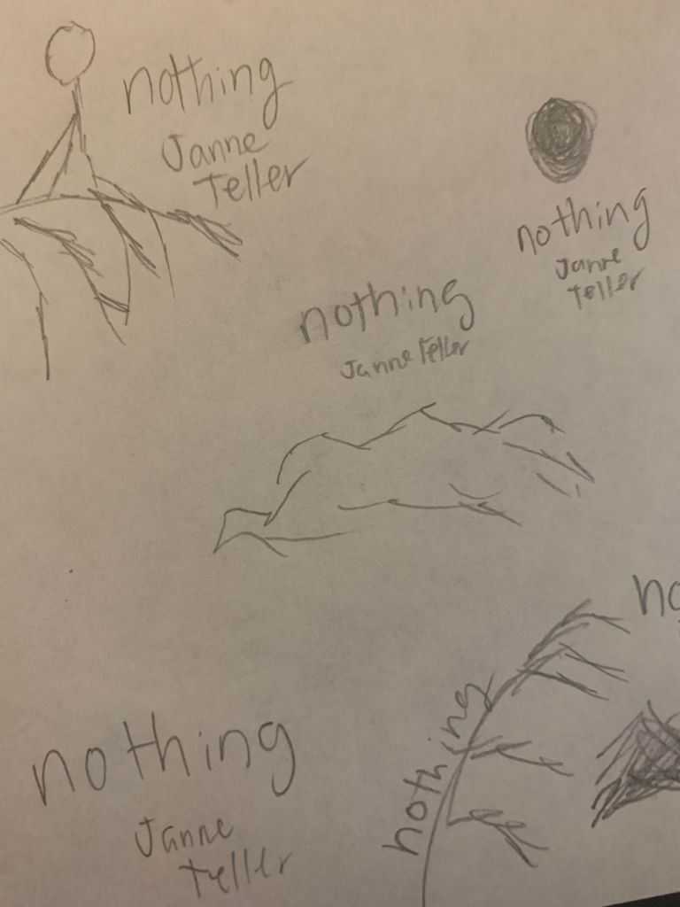
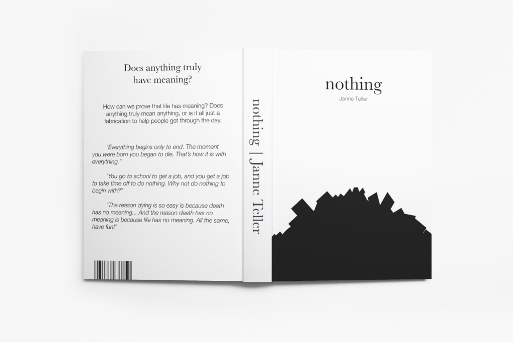
Nothing
Nothing is a novel purely about nihilism. Children in the novel are fighting against it, and thus bring together what they deem a ‘pile of meaning’. I thought I could work off this, in my preliminary work I was trying to figure out a simplistic way to convey a large pile of nothingness.
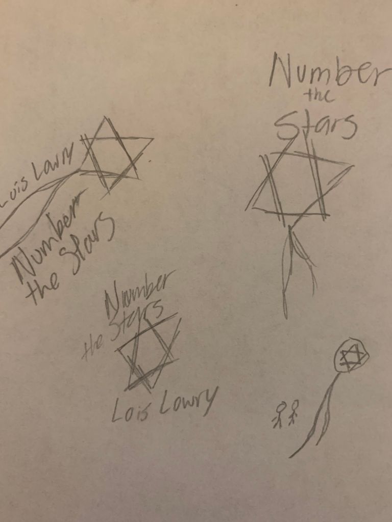
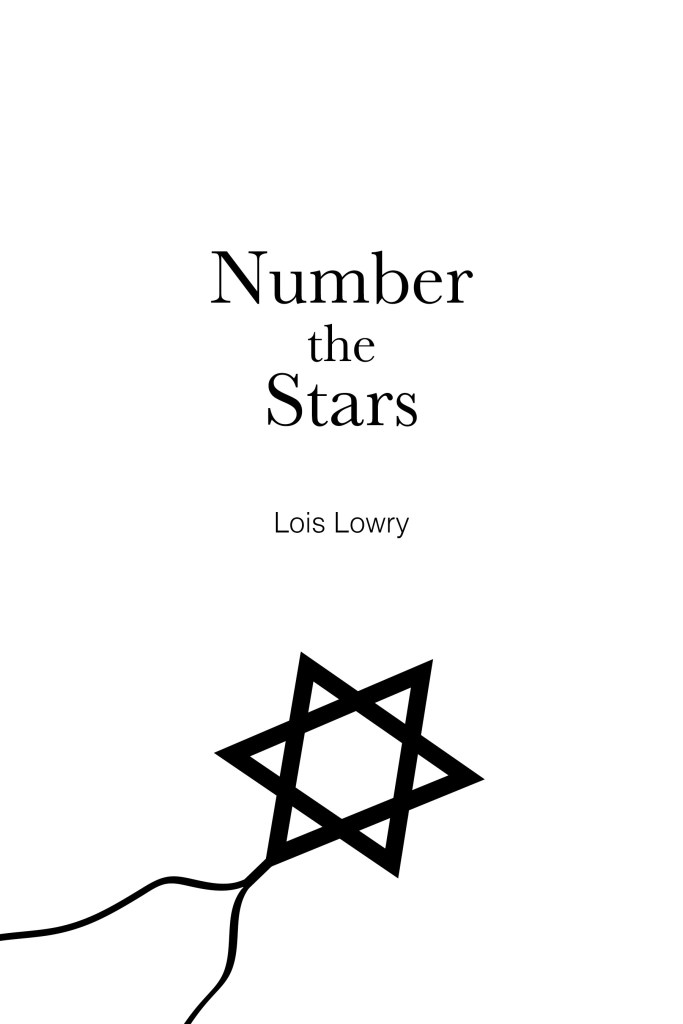
Number the Stars
Number the Stars follows a girl escaping Nazis, as they have taken over Denmark. Through this quest the Star of David locket serves as symbolism for her battle. I knew going into this that I needed to make use of the star, otherwise the cover would not truly capture what the book deemed extremely important, a symbol of the story overall.
Working through this process was great. As I worked through the preliminary stages I really had a vision for the end product and was able to bring it to fruition. Quite quickly I was able to find what it was that I wanted to do with each novel and translate it to a final draft.


Working through the kinks of how I would translate each book over to a cohesive series was my favorite part. I decided to go for minimal symbolism, capturing the true meaning of each story within a simple but effective illustration. Through the use of contrast and clean, simplistic design, everything came together quite well in terms of the final book covers.
Final Products